Personal project — June 2021
This project has been a long time in the making, between mutliple days of art block and countless ideas I've wanted to implement. An exercise in discipline, between wanting to go all-out, and sticking to my own set brand guidelines. The contrast between what is typically a lively, colorful, hyperactive rhythm game, and creating a fresh, clean look to keep information readable and understandable.
Etterna is an open-source branch of Stepmania 5, a rhythm game made for PC meant to mimic the popular Dance Dance Revolution series. Being on PC, players can play with either a dance pad or keyboard, and since its inception, the popularity of keyboard play has grown exponentionally. While Stepmania at its core is a basic reproduction of Dance Dance Revolution, Etterna is built by and for keyboard players, and focuses heavily on intricate skills and tech, with charts that may be difficult or impossible to play using a standard dance pad.
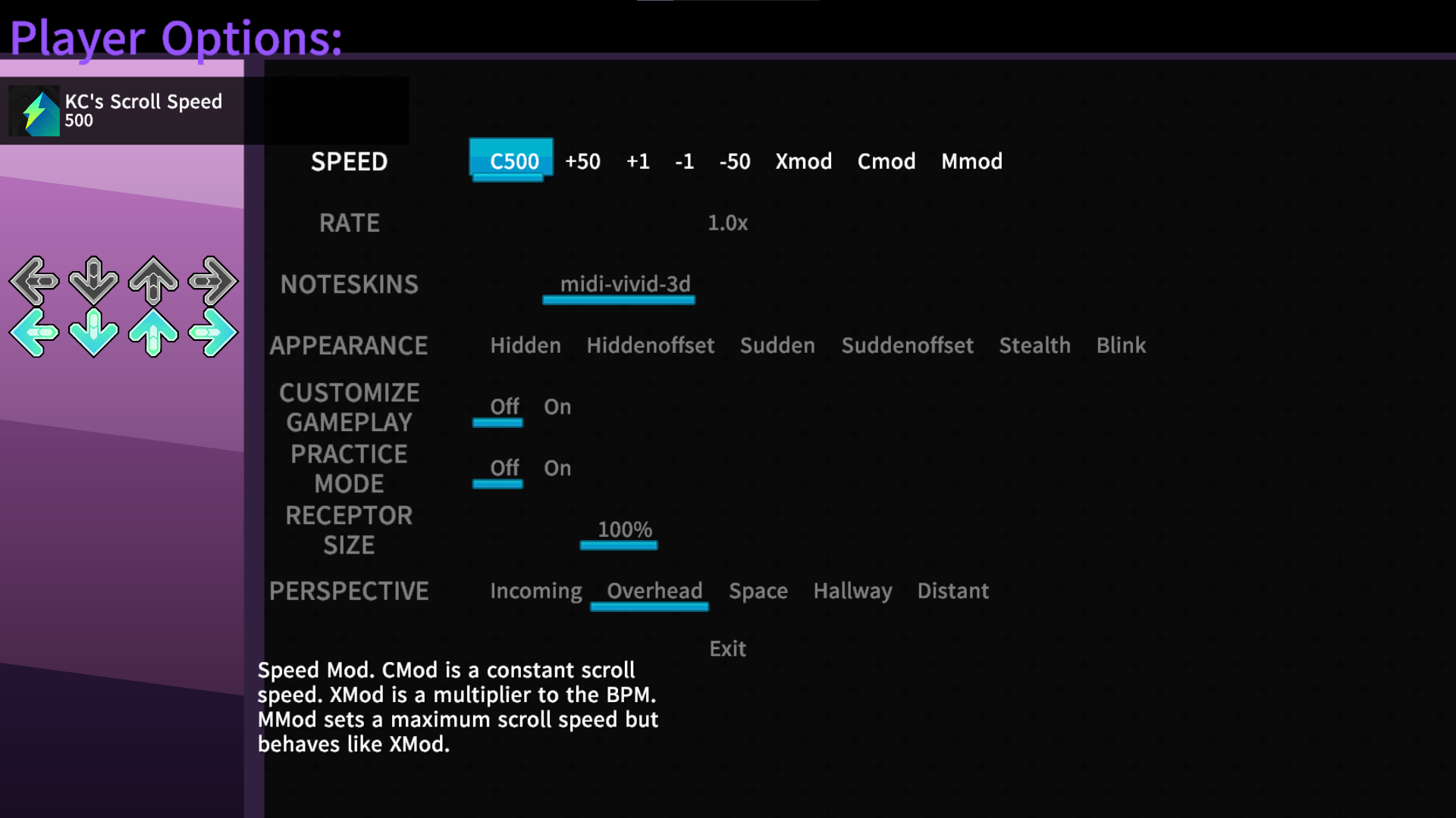
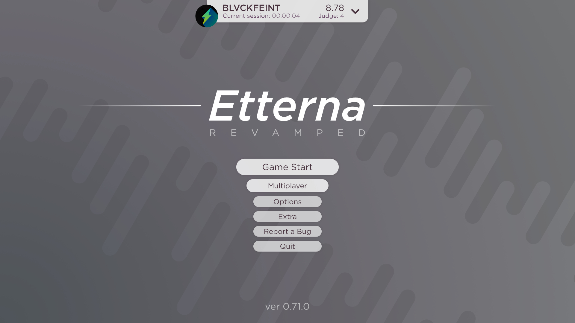
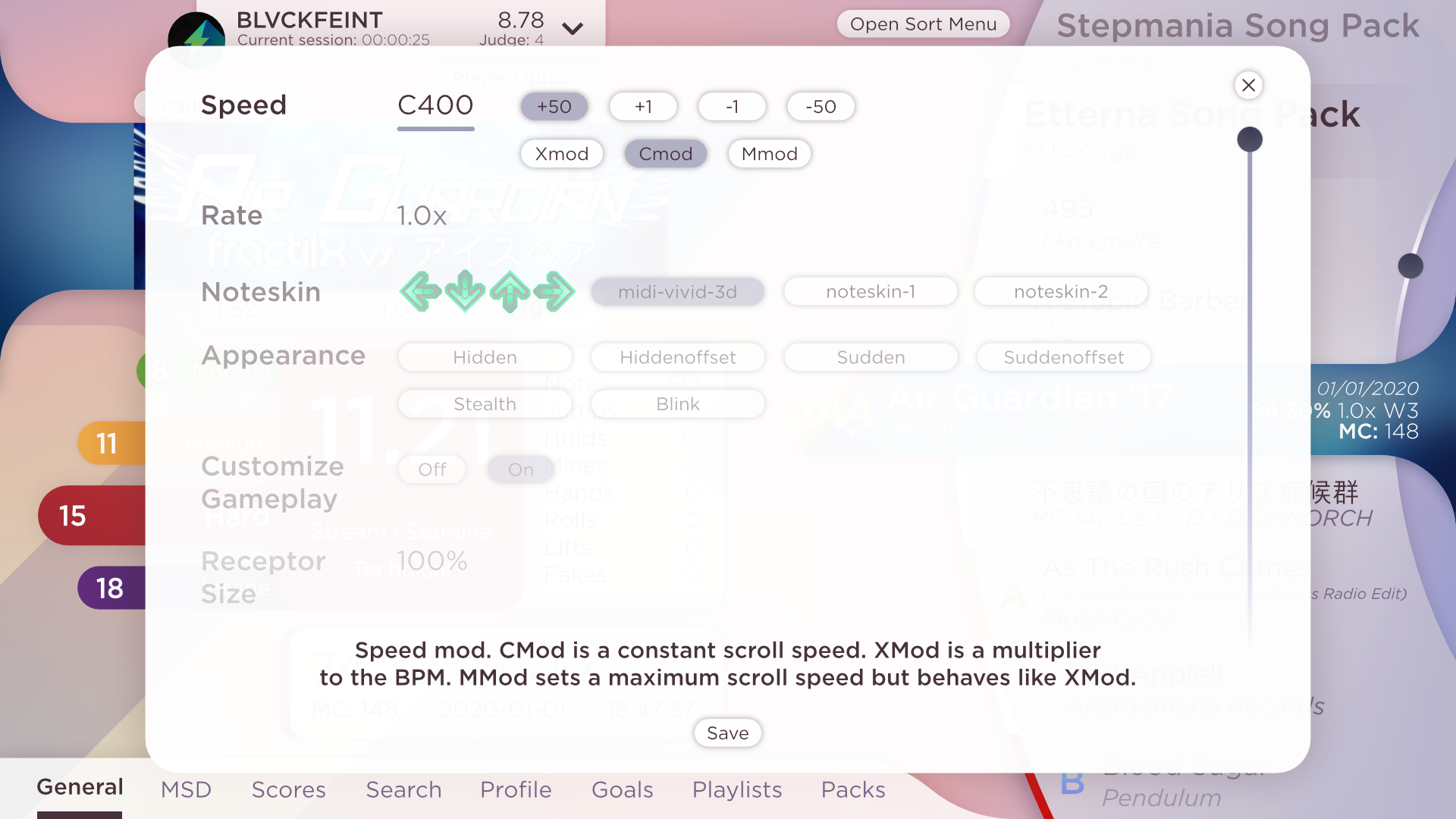
As it stands, Etterna's UI focuses more on function than form. It gives you the numbers and information you need to know, but is very basic in the way of design and information hierarchy. I thought this would be a fun project to tackle, with the goal of keeping the simplicity of Etterna while still breathing some life into the UI, and improving visual hierarchy to allow players to easily understand what pieces of information are communicating. Again, this became a lesson in discipline, between wanting to make the UI lively, and keeping it simple enough that it's not overwhelming, just nice to look at.
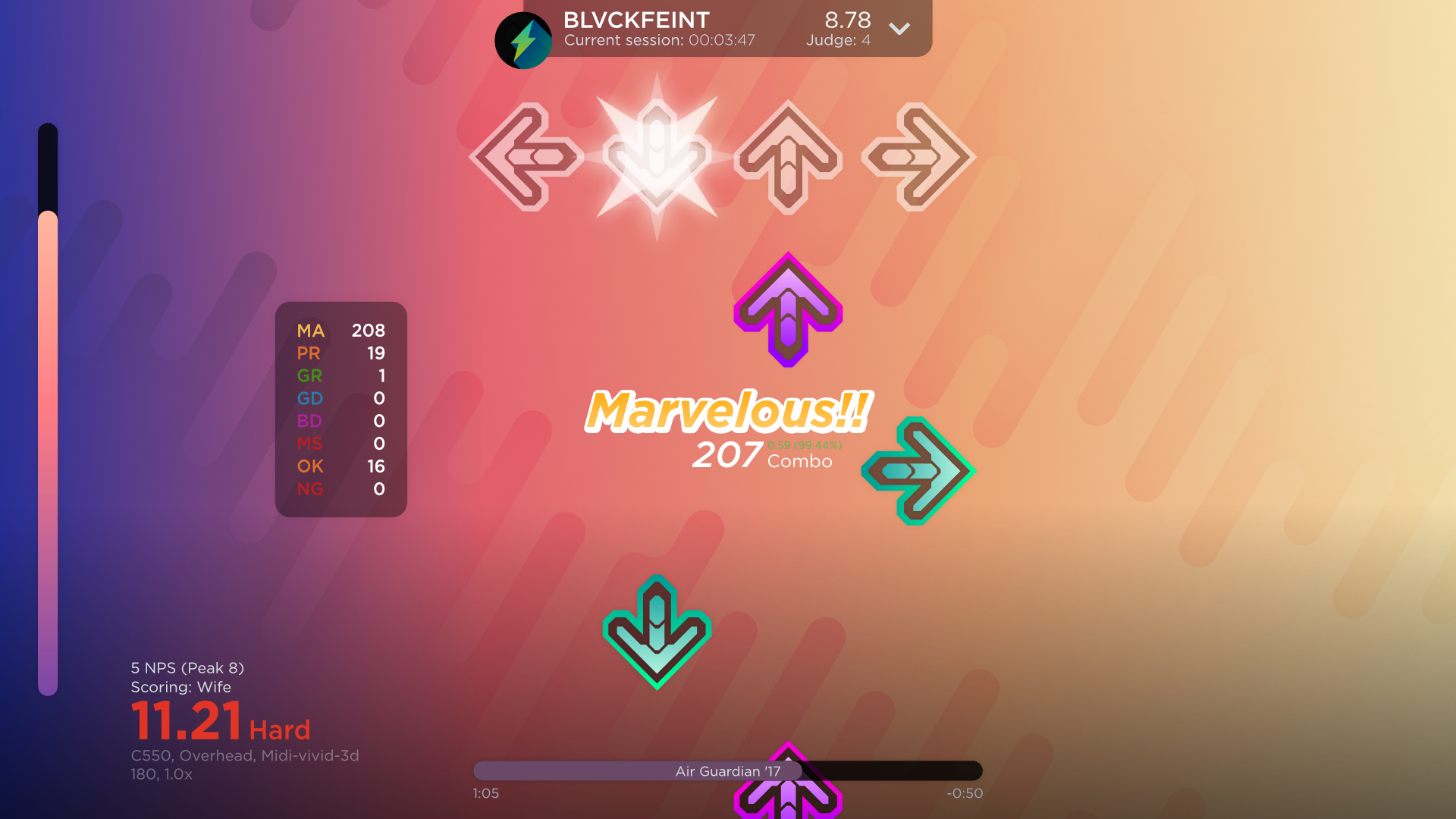
One of the glaring issues for me when I first started using Etterna, was that I had very little idea what all of the numbers on the screen meant or were associated with. There didn’t seem to be any type of hierachy that would be familiar to people coming from Stepmania or Dance Dance Revolution. This made some sense, as Etterna is based more on the tech and numbers, but I know it could be better.


The visual aesthetics were also very basic, and left me wondering what a full overhaul of the UI could look like. What would a good default theme look like? What could fit the basic brand of Etterna, and what elements would that include?
In thinking about the UI, I know I wanted to keep things simple. I wasn’t aiming for anything super extravagant, but being a rhythm game, I didn’t want it to be ultra minimalistic either. I needed to balance both form and function. I decided on basic shapes and colors, with hints of drop shadows and gradients, just to give it a little visual interest. I based the color scheme off the vibrant arrow colors seen in previous Dance Dance Revolution games, those colors being red, yellow, blue, and purple.


When it came to the hierarchy, I collected all of the information seen on a given screen, and went through them one-by-one, thinking about how necessary each bit of information is to the typical player. What needs to be shown? Difficulty ratings, tech numbers (the amounts of jumps, holds, etc.), pattern types. What things can be smaller, or even hidden away in menus? High score dates, session runtime, lifetime arrows smashed. I didn’t want to stray too far from the visual information that Etterna users have come to know. It was a careful balance between staying true to the seasoned player, and organizing things in a way that makes sense.


With the completion of this project, I learned to read and recognize what information is important, and how it can best be arranged. With a game as complex as this, in aiming to make it user-friendly for both novices and experienced players, sometimes you can’t make all information clear to every viewer. Recognizing what elements mean can sometimes depend on the viewer having prior knowledge of the game, and that’s okay! You can’t make everything suitable for all audiences, but you can try to make it easier on newcomers, and better for veterans.

